Project Timeline:
My Role:
Tools:
12 Weeks
Role: Product Designer (UX/UI)
Jira, Figma, Mural, Wave, Maze, Sketch,
Notion, Material design guidelines, feedback plugins figma
Initial Problem Discovery
Why was there a disconnect between members needs and the system BizX had in place
User Goals
Business Goals
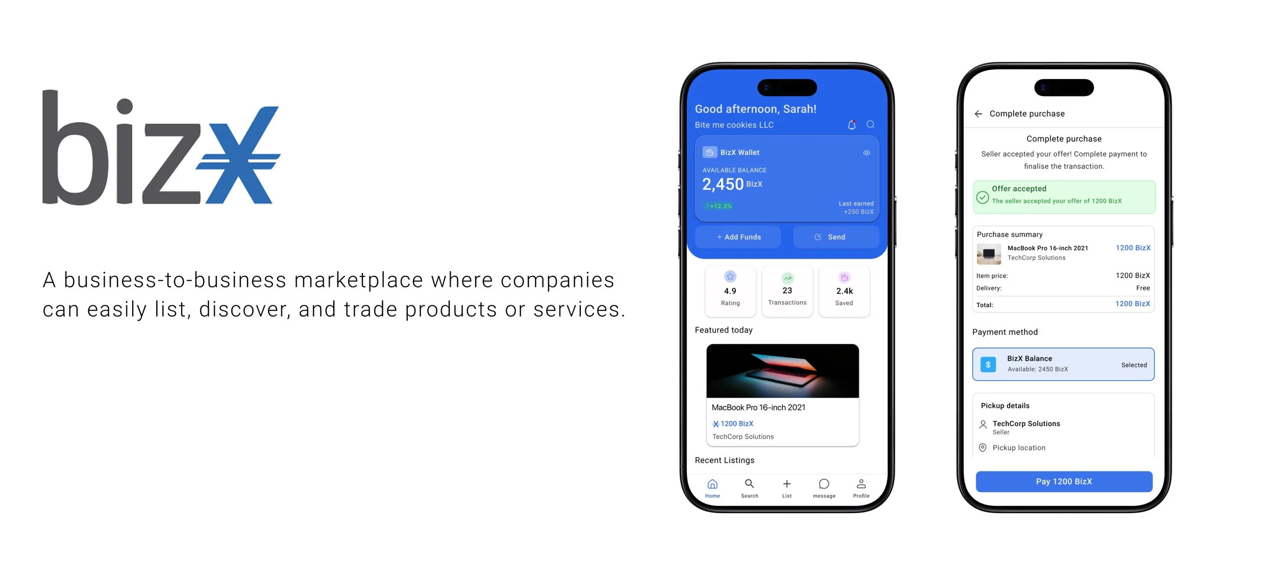
The Problem
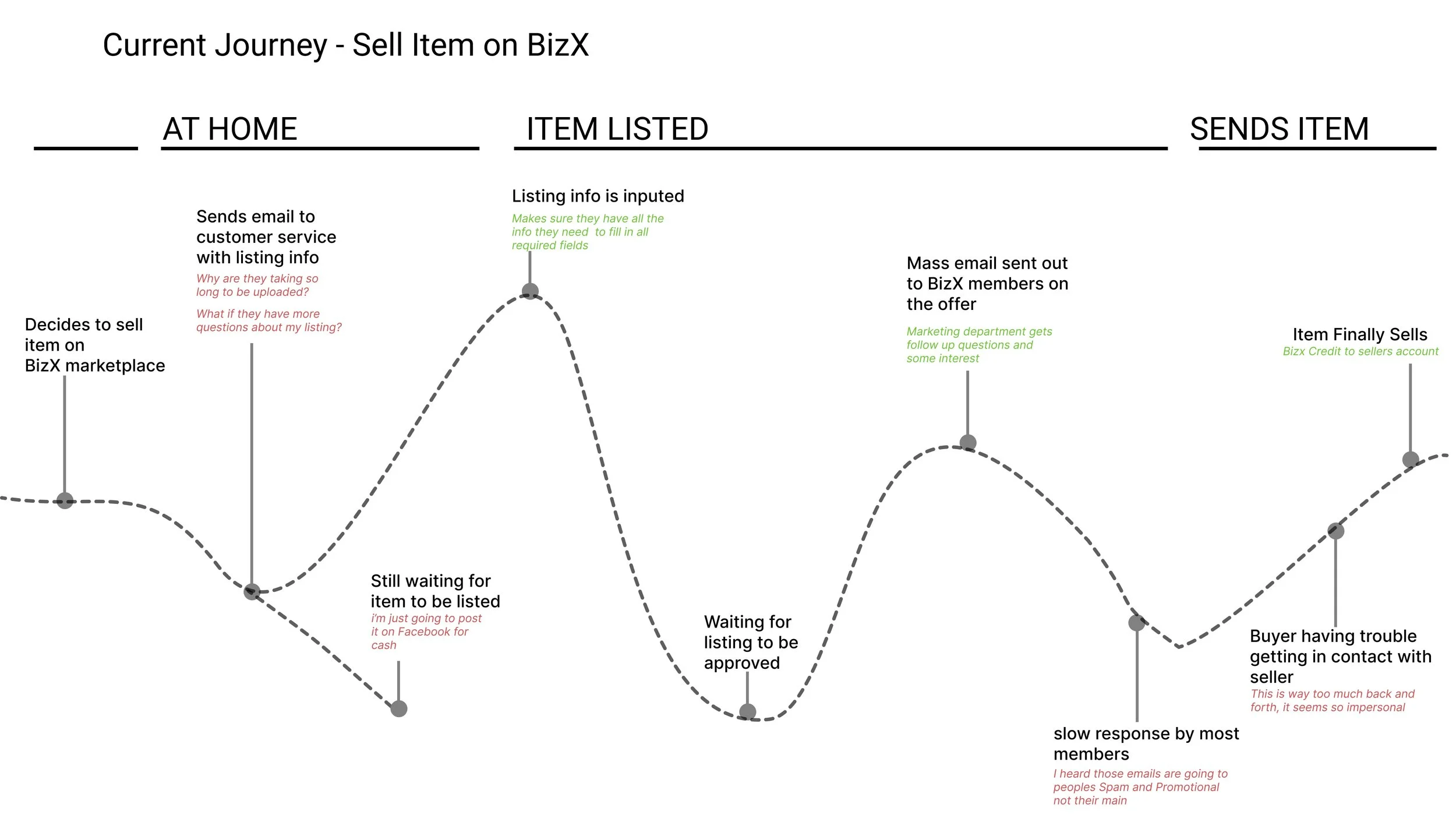
BizX members struggled with an outdated, process that made buying and selling slow, frustrating, and inefficient.
This created:
Friction for members who wanted speed and autonomy.
Time drain for BizX staff acting as middlemen.
Limited visibility for buyers to discover listings in real time.
Constraints
Legacy System Integration
Adoption Risk
2. Consistency
3. Internal constraint
My Role
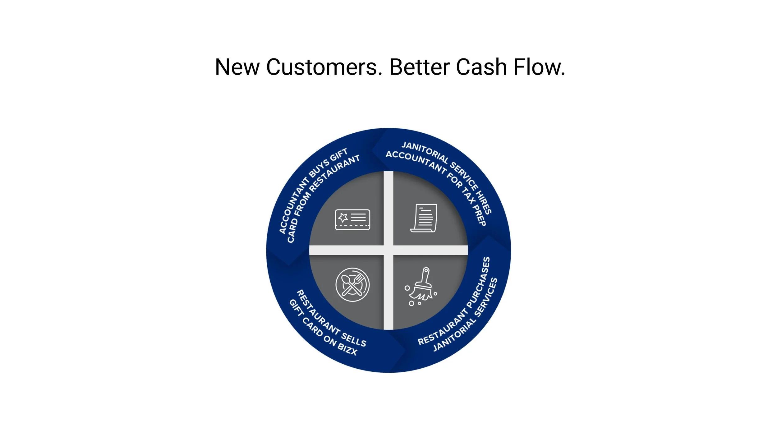
As design lead I was asked to redesign the marketplace process to make it easier to use while increasing functionality to account for more member to member transactions
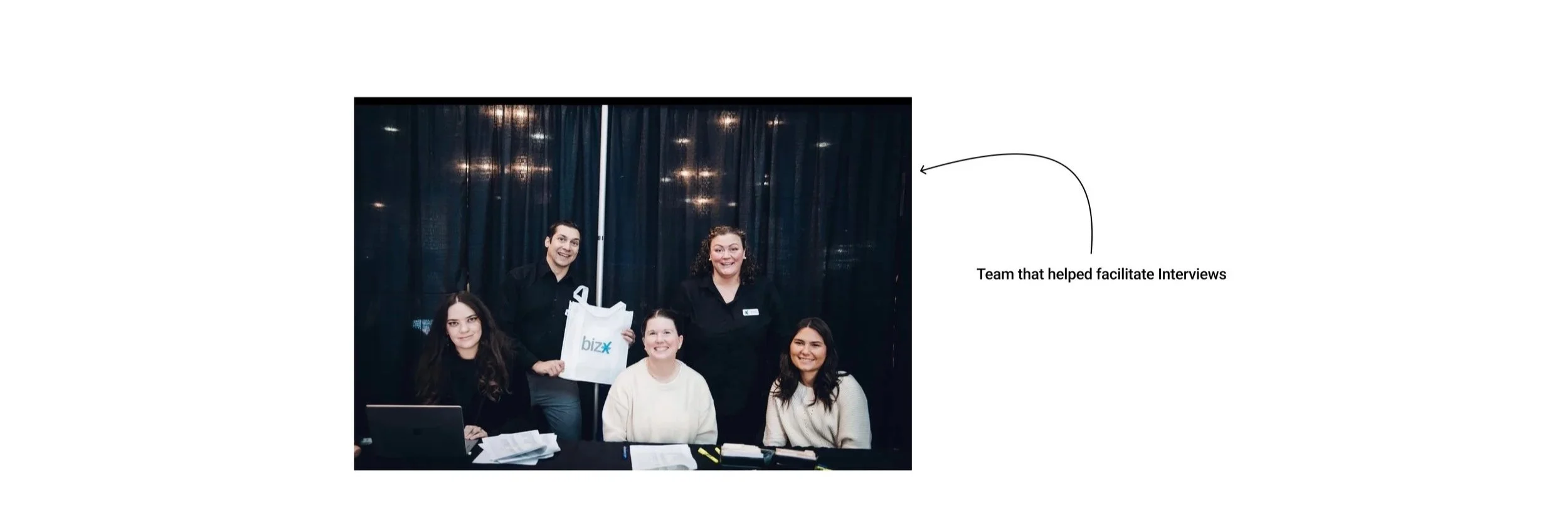
Team
3 Product Managers
1 Marketing manager (occasionally)
1 Product Designer
1 Ceo
Engineering team outsource - communicated with head of the team via zoom at odd hours..
White paper Research
I wanted to dive deeper into our users' cognitive insight and really understand at a broader scale the human factors that play a role in their behaviors and feelings.
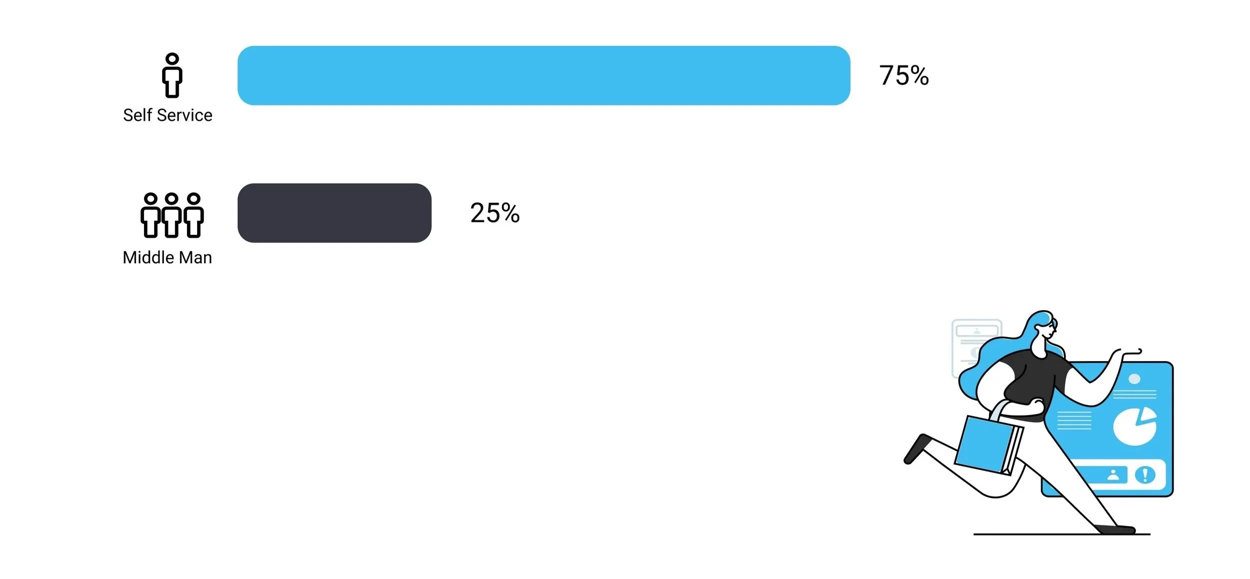
75 %
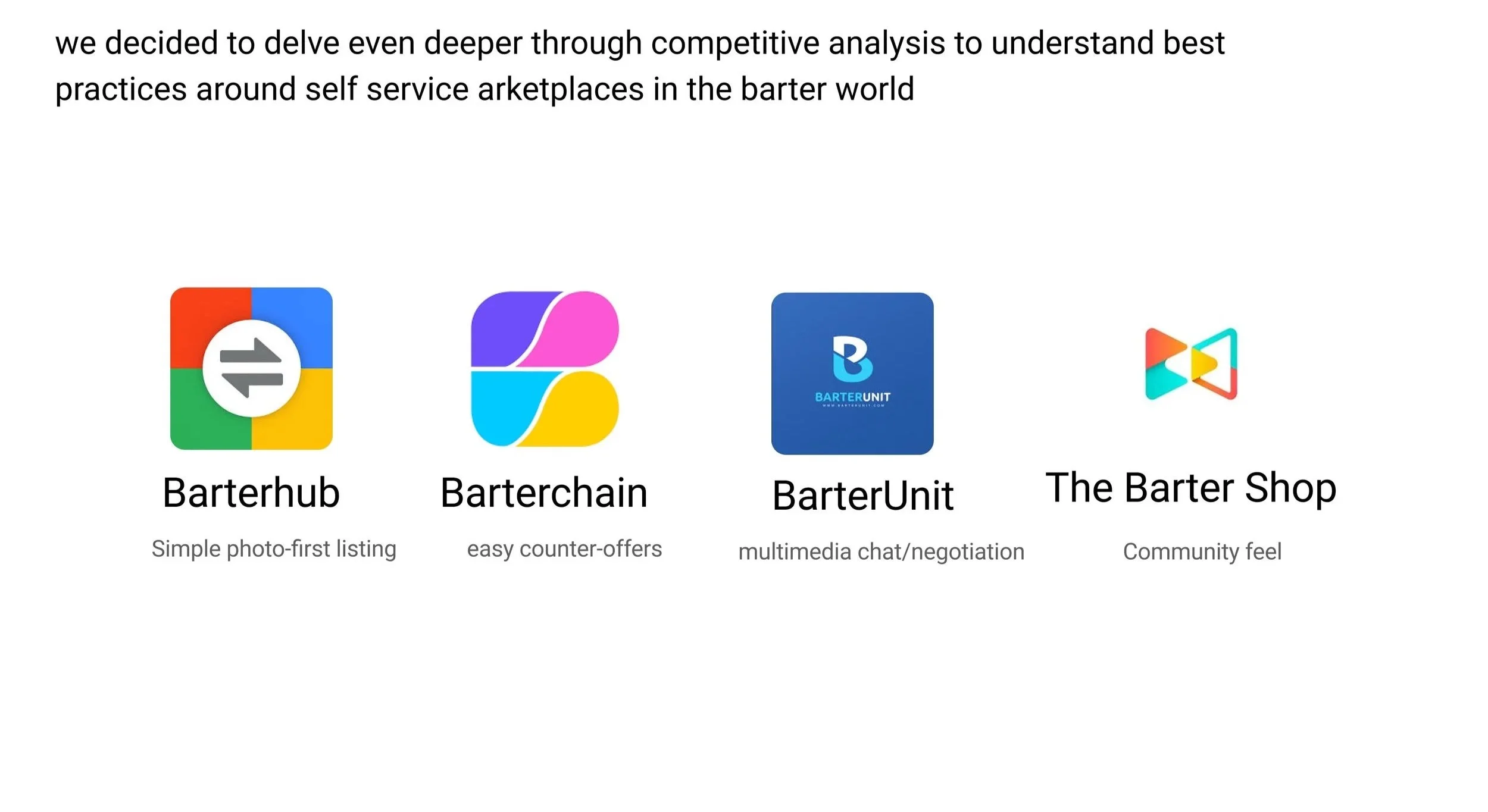
Competitive Analysis
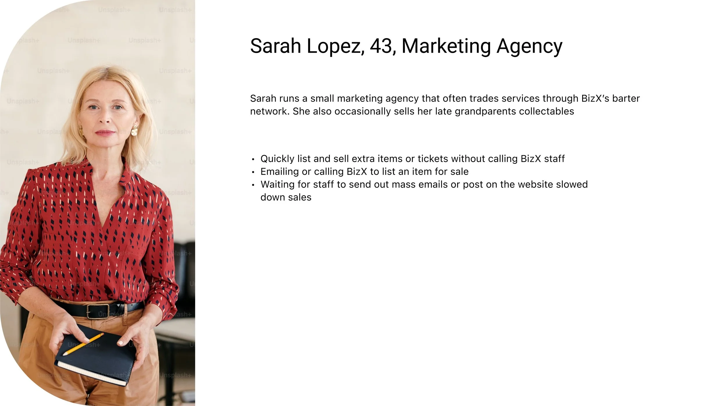
User Interviews
What challenges or frustrations do you usually face when trying to list an item or service?
If you could change one thing about how listings are posted, what would it be?
How do you usually discover items or services on BizX, and what makes that easy or difficult?
What makes you trust (or not trust) another member’s listing?
Have you used other marketplaces like Facebook Marketplace or OfferUp? What felt easier or better about those?
Insight & Analysis
Key Insights


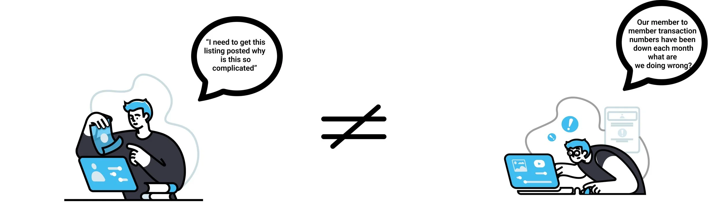
Frustration with Manual Process
“I don’t have time to email BizX every time I want to sell something. By the time it goes out, it’s too late.”
Lack of Visibility
“I never really know what’s available unless I catch one of the emails and the website is way too old”
Desire for Self-Service
“I want something quick, like posting on OfferUp or Facebook. Just snap a photo, add a price, and done.”
Trust & Transparency
“If I buy from another member, I want to see who it is and know I can trust them.”
More specifically, I found that my interviewees were nearly 3x more likely to post regularly if they had a simple self service option compared to relying on BizX staff.
How might we...
How might we make it easier for members to post and manage their own listings without relying on staff?
Testing Design Concepts

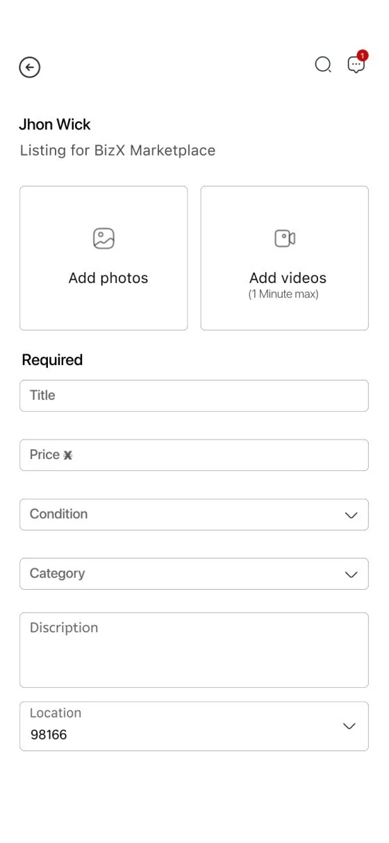
One-Page Listing Form

Smart Self-Service

Template-Based Self-Service
Determining the flows of this app
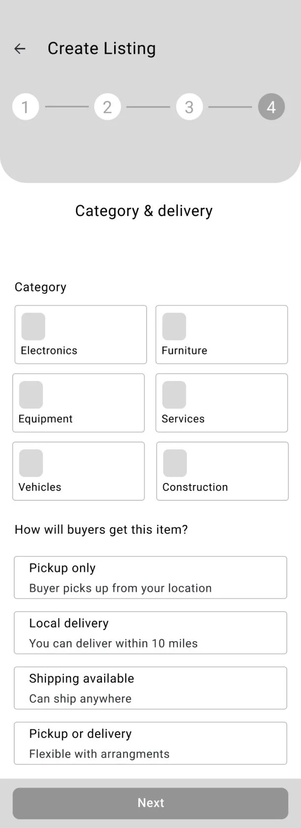
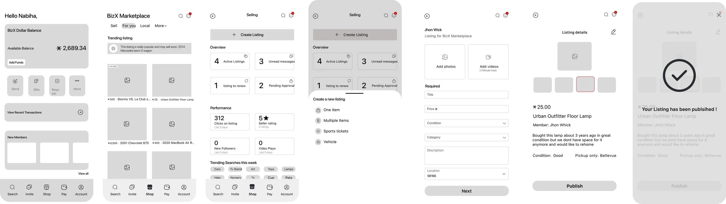
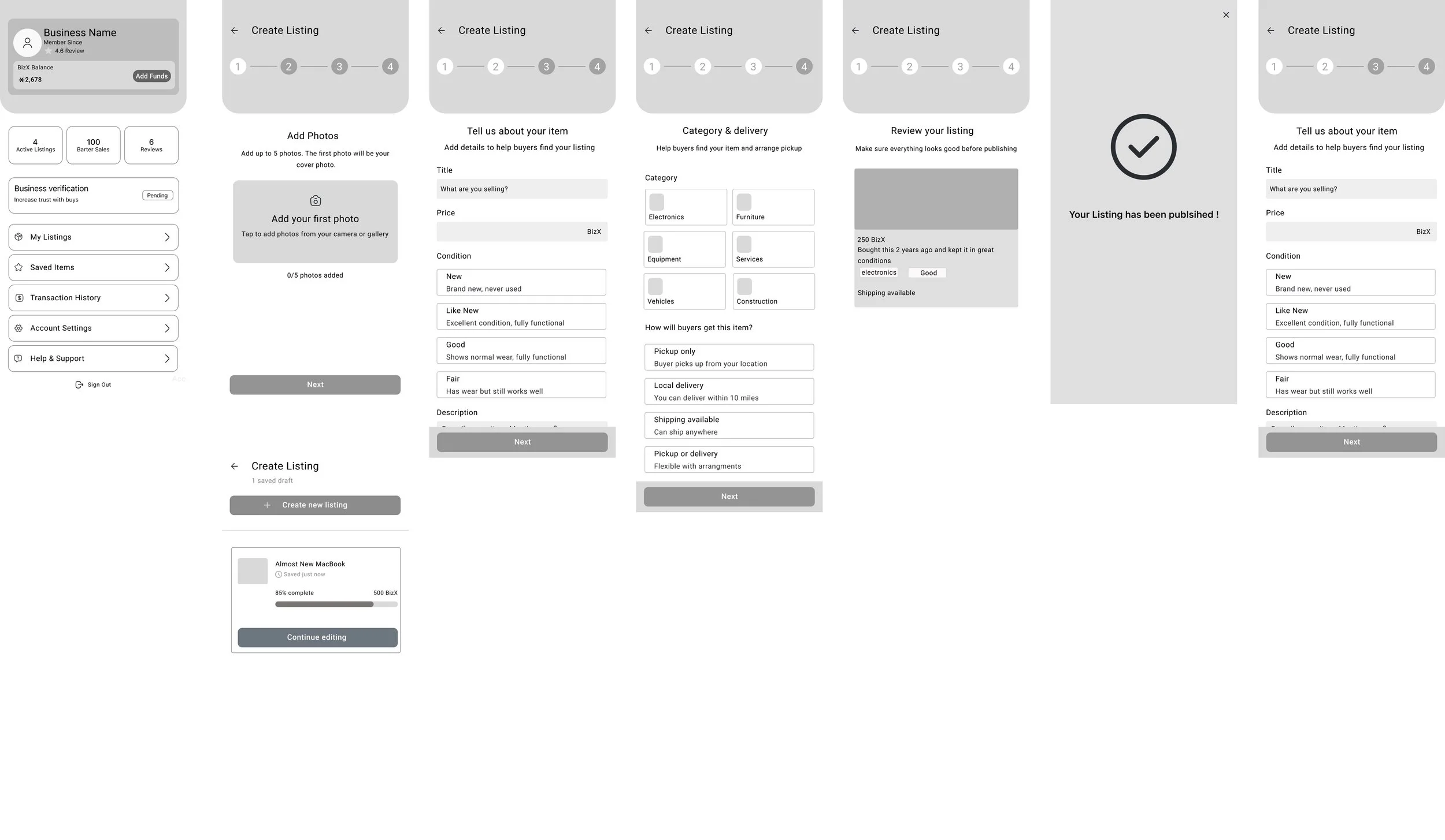
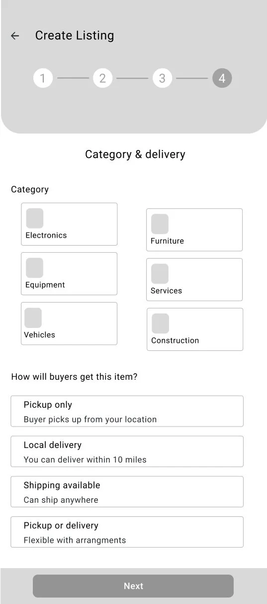
Create a Listing (Seller Flow)
Browse & Discover Listings (Buyer Flow)
Inquire & Purchase (Transaction Flow)
Testing + improvements
First major improvements

Added Progress Indicator in Listing Flow
Users said they felt uncertain about how long it would take to create a listing and wanted to know where they were in the process
Added a progress indicator at the top of the screen
Testing + improvements
First major improvements

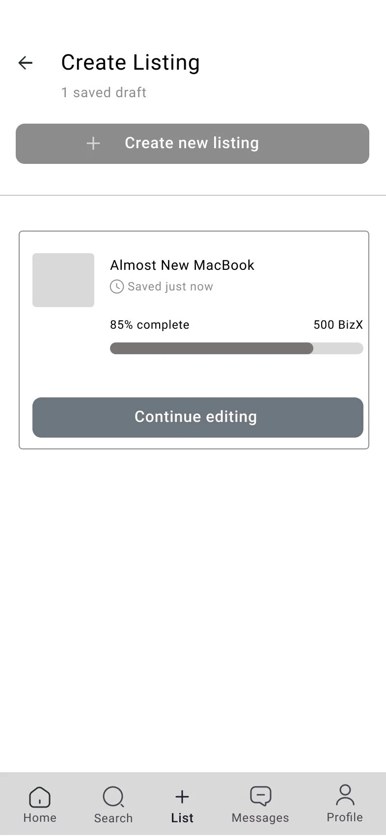
2. Autosave listing drafts
“Sometimes I start posting, then I get pulled into a call and i don’t want to redo everything”listings now save automaticallyThis ensured that every step of progress was preserved automatically, so members could return later and seamlessly pick up where they left off
Testing + improvements
First major improvements
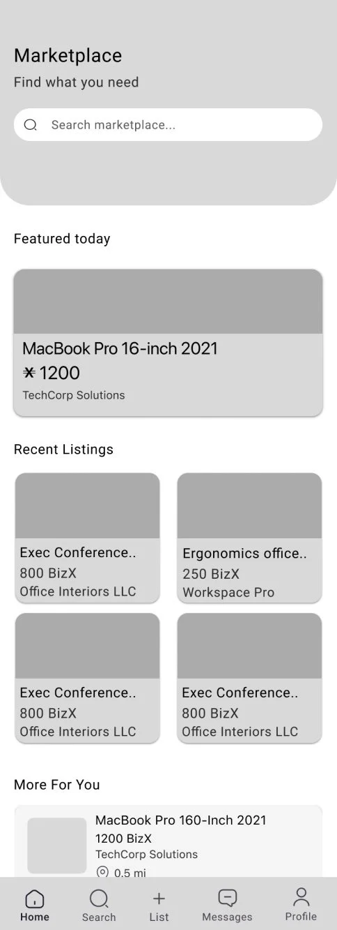
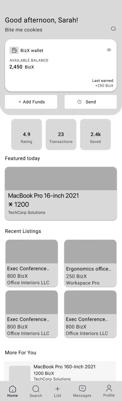
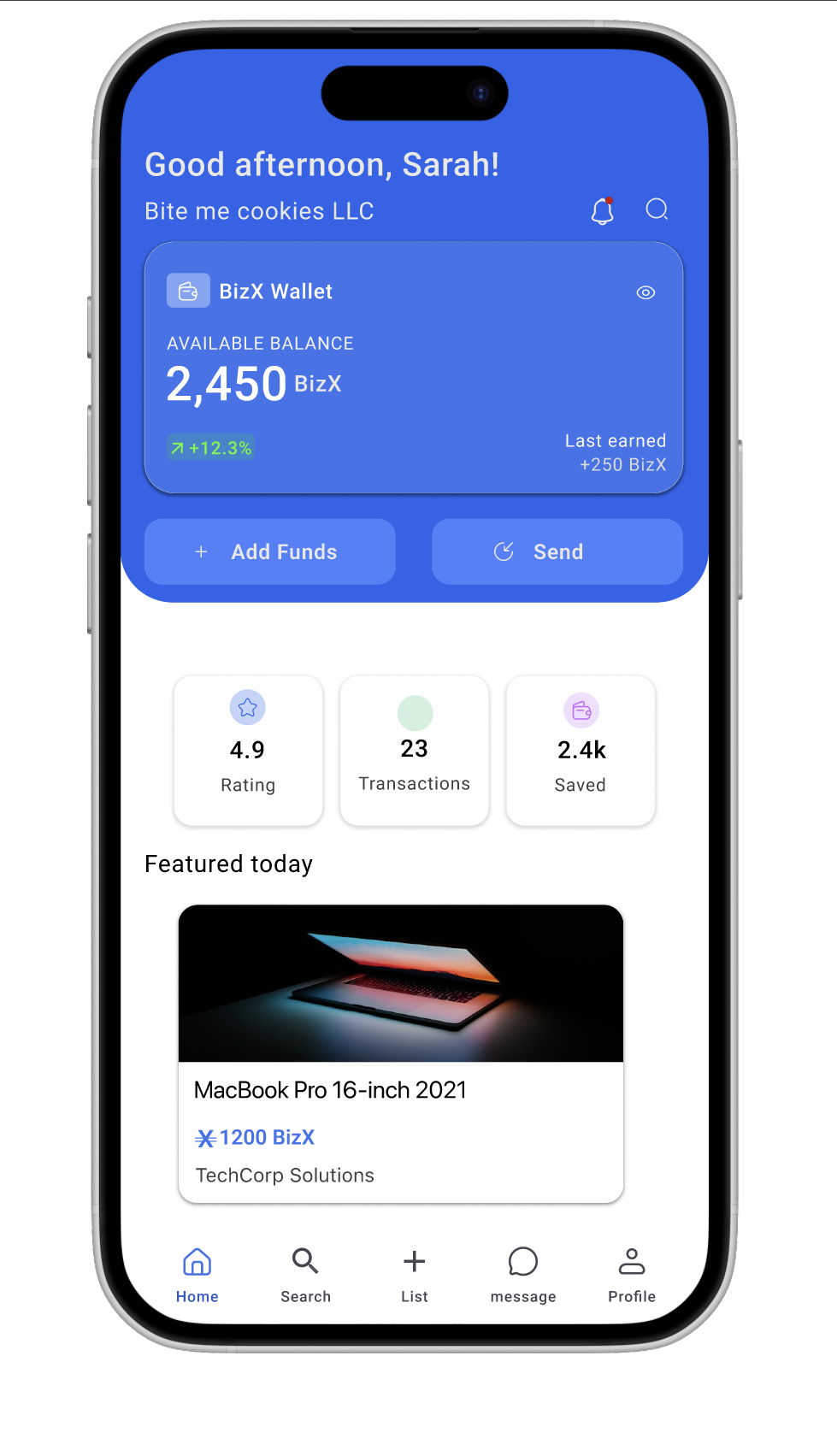
3. A More Personable Homepage
During testing, users mentioned they wanted to quickly see their BizX balancePrioritized quick access actions like “Add funds” or “ Send.”This shift made the homepage more intuitive and personable, giving members a sense of ownership and immediate value every time they opened the app.
Site Map
To ensure a clear and intuitive user flow, I created a site map that maps out the key pathways within the BizX app. The map highlights important states such as active, sold, drafted, and pending approval listings, as well as support resources like marketplace rules and how to guides. By visualizing these pathways, I was able to identify potential friction points and ensure that members could navigate seamlessly between creating, managing, and purchasing listings.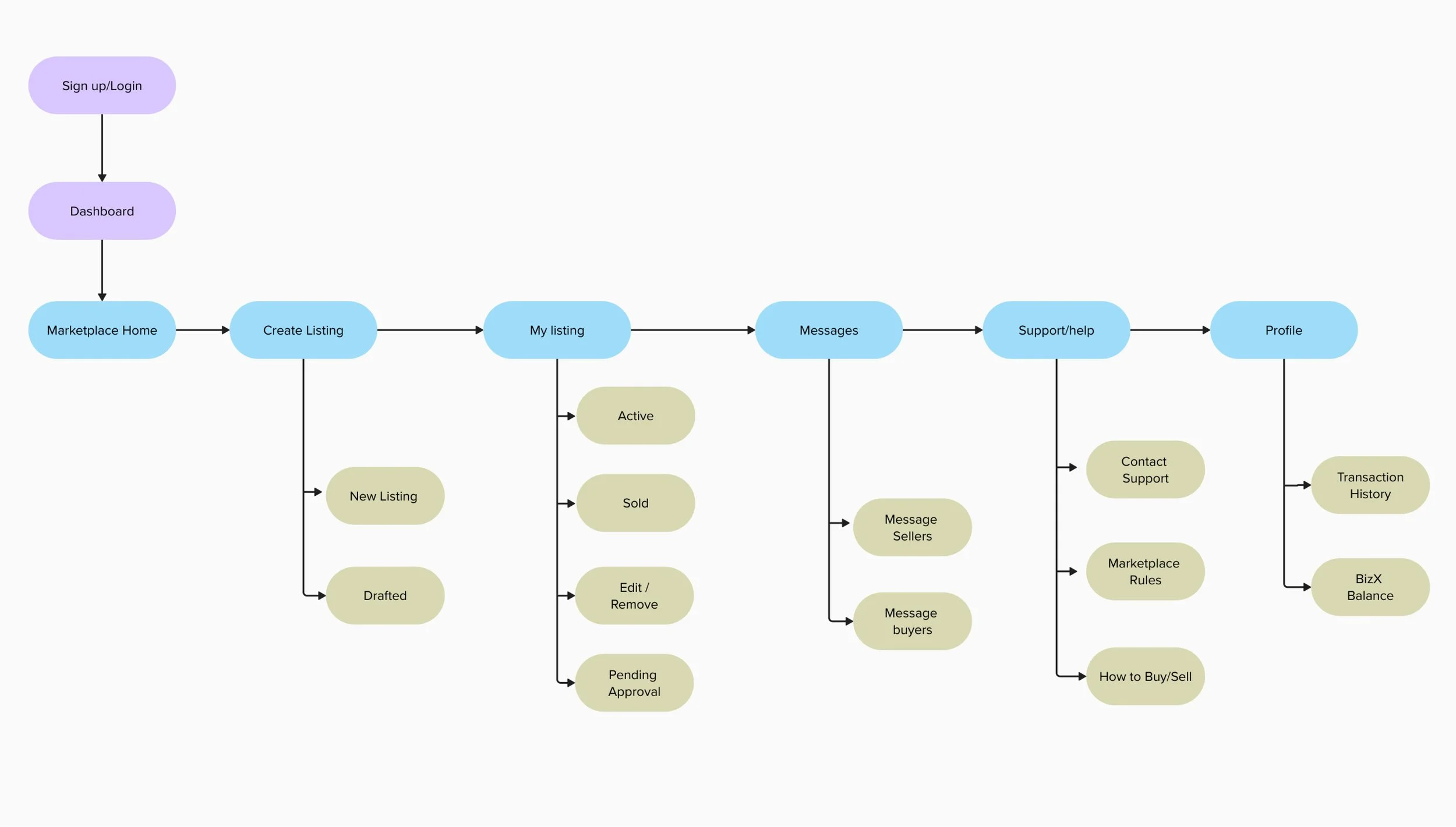
User Flow
I created a user flow for a member selling an item to map out the key decisions and actions in the listing process. This helped me validate that the redesigned flow was intuitive, reduced friction, and aligned with familiar marketplace patterns.
Creating a listing
Reduced Staff Dependency
Streamlined and Transparent Posting Experience
Smarter, More Reliable Listings
Overview
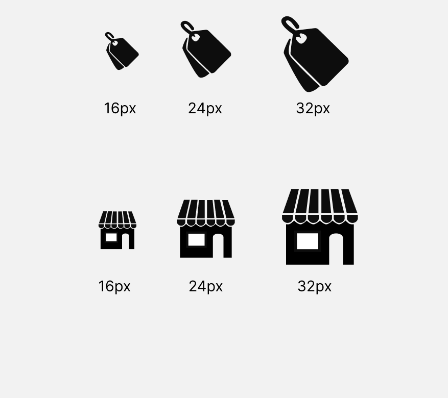
I designed a modern, scalable icon system that enhances clarity, improves scannability, and supports the unique workflows of a B2B platform with a diverse user base including many older users who rely heavily on recognizable visual cues.
Testing at Multiple Sizes
Since B2B tools often scale icons between 16px–32px, I tested each icon at small and large sizes to ensure clarity.
Variants created:
outline icons
filled versions for active/selected states
monochrome versions
accessibility-safe contrast variations
consistent negative space
equal stroke width
optical balancing (nudging shapes by 1–2px where needed)
consistent visual weight


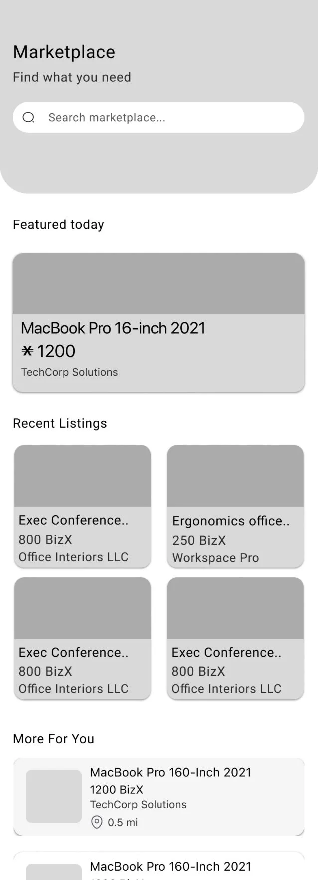
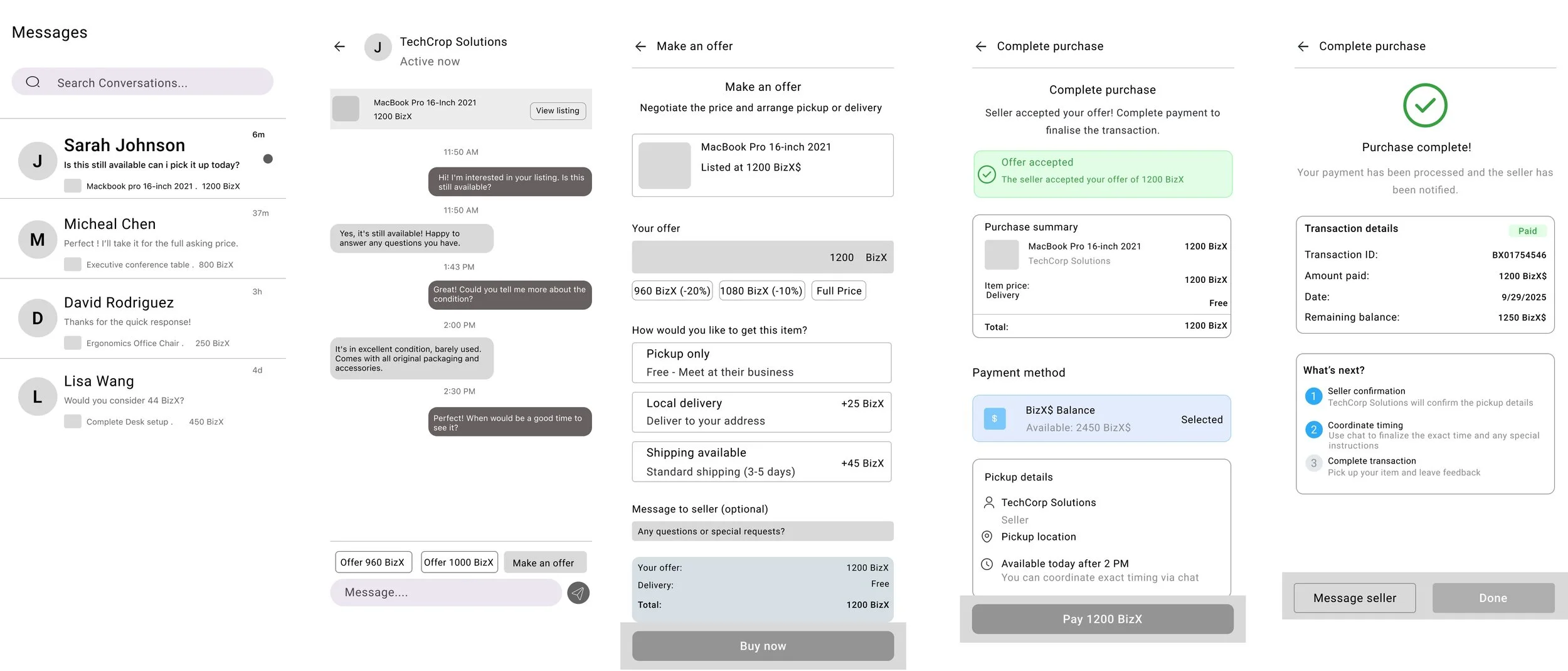
Browse and purchase
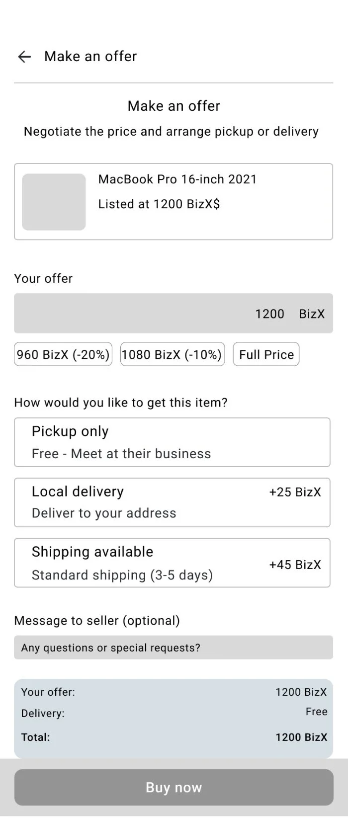
Simplified Buyer Journey from Discovery to Purchase
Integrated Messaging for Instant Communication
Transparent Transaction and Confirmation States
Gradient → Flat UI design
Built from white to maintain clean UI

Removed gradient changed to main color to fit WCAG standards
Success Metrics
To measure success, I tracked how quickly and easily members could complete a core task:
creating and publishing a listing
Purchasing an item on the marketplace
Success was defined by:
Task completion rate
92% of participants were able to successfully publish a listing without staff assistance (up from 40% under the old process)Time on task
Average time to post an item dropped from ~10 minutes (with email back-and-forth) to under 3 minutesError rate
Usability issues (e.g., missed fields, confusion on fulfillment options) were reduced by 65%
If Ii had more time.....
Ai & Advanced recommendation system
Analytics dashboard

Takeaways & What id do different
1. Design decisions should evolve with user behavior.
2. Continuous feedback is key