BizX Copilot: B2B Marketplace
2023-2024
My redesign focused on creating a BizX Copilot, AI-powered assistant designed to increase trust, clarity, and transaction efficiency within the B2B barter marketplace. By combining pricing intelligence, seller reliability insights, and structured negotiation support, Copilot reduces friction while preserving user agency in a credit based economy.
+20 %
ConversionBusiness impact
97 %
Customer retention+15 %
Member transactionsBuyer Copilot Marketplace Flow:
Before
After
-
![]()
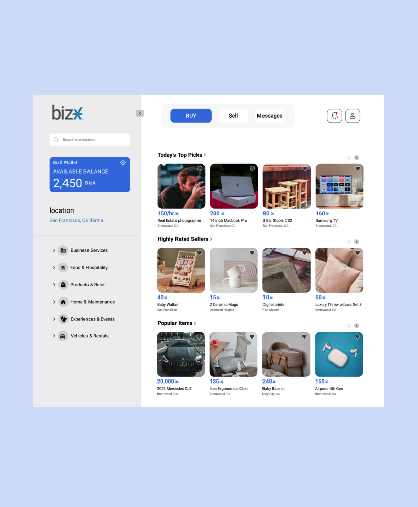
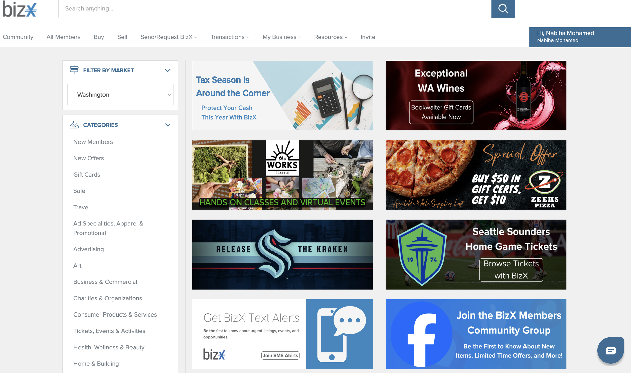
Marketplace Exploration
Buyers browse listings priced in BizX currency and evaluate opportunities before initiating conversation.
-
![]()
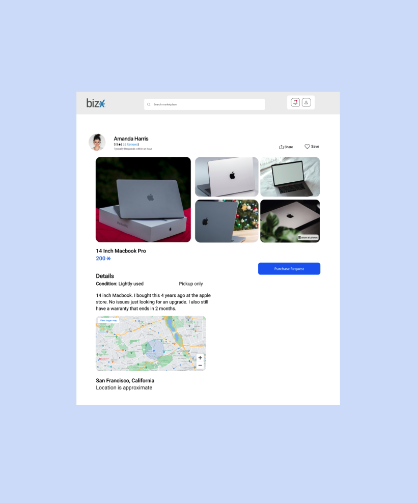
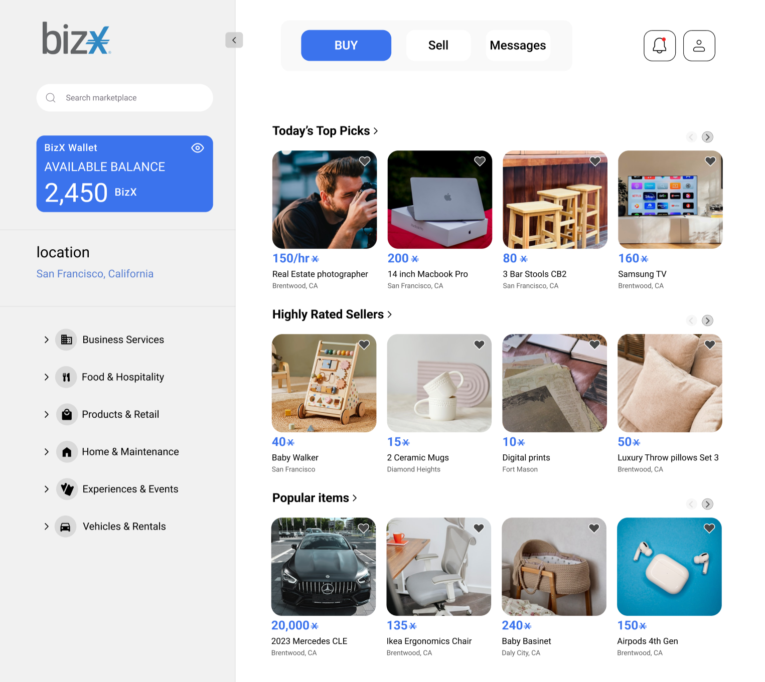
Listing Evaluation
Buyers review item details, pricing, seller ratings, and initiate messaging.
-
![]()
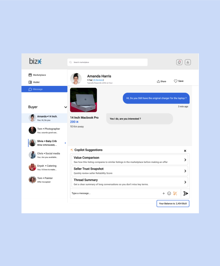
Messaging + Copilot Activation
Copilot integrates pricing intelligence, seller trust signals, and thread summarization directly into the messaging experience.
-
![]()
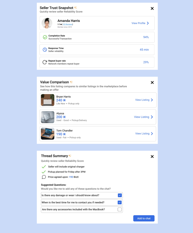
Decision Intelligence Layer
Copilot provides real-time insights to reduce uncertainty and increase transaction clarity.