Soccer Training Platform
UX/UI, Visual Systems & AI Assistance
Role And Objective:
6 weeks
Timeline:
Brief context:
Goal:
Creating an engaging, accessible landing page for parents to discover and enroll their children in a local soccer program
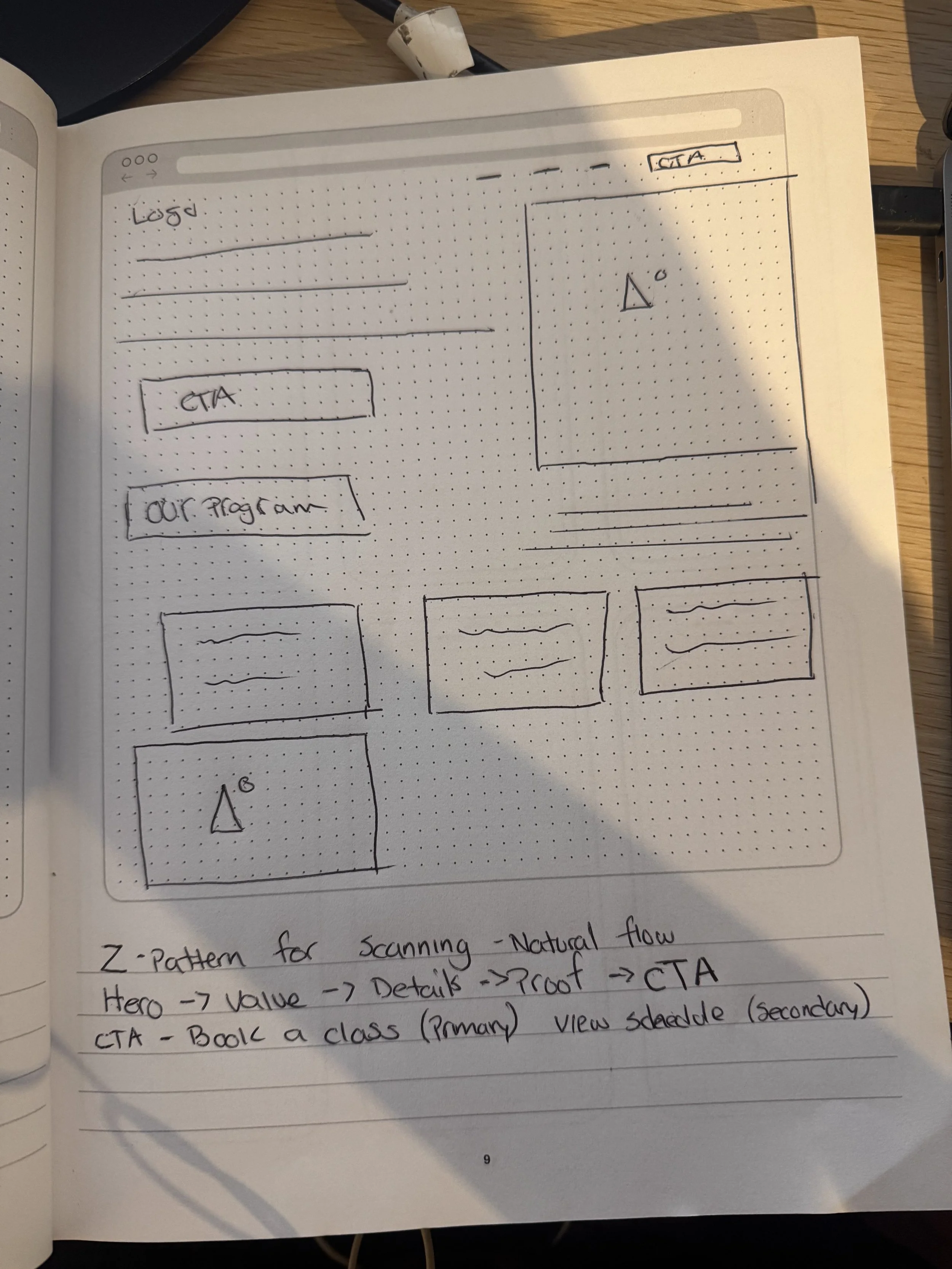
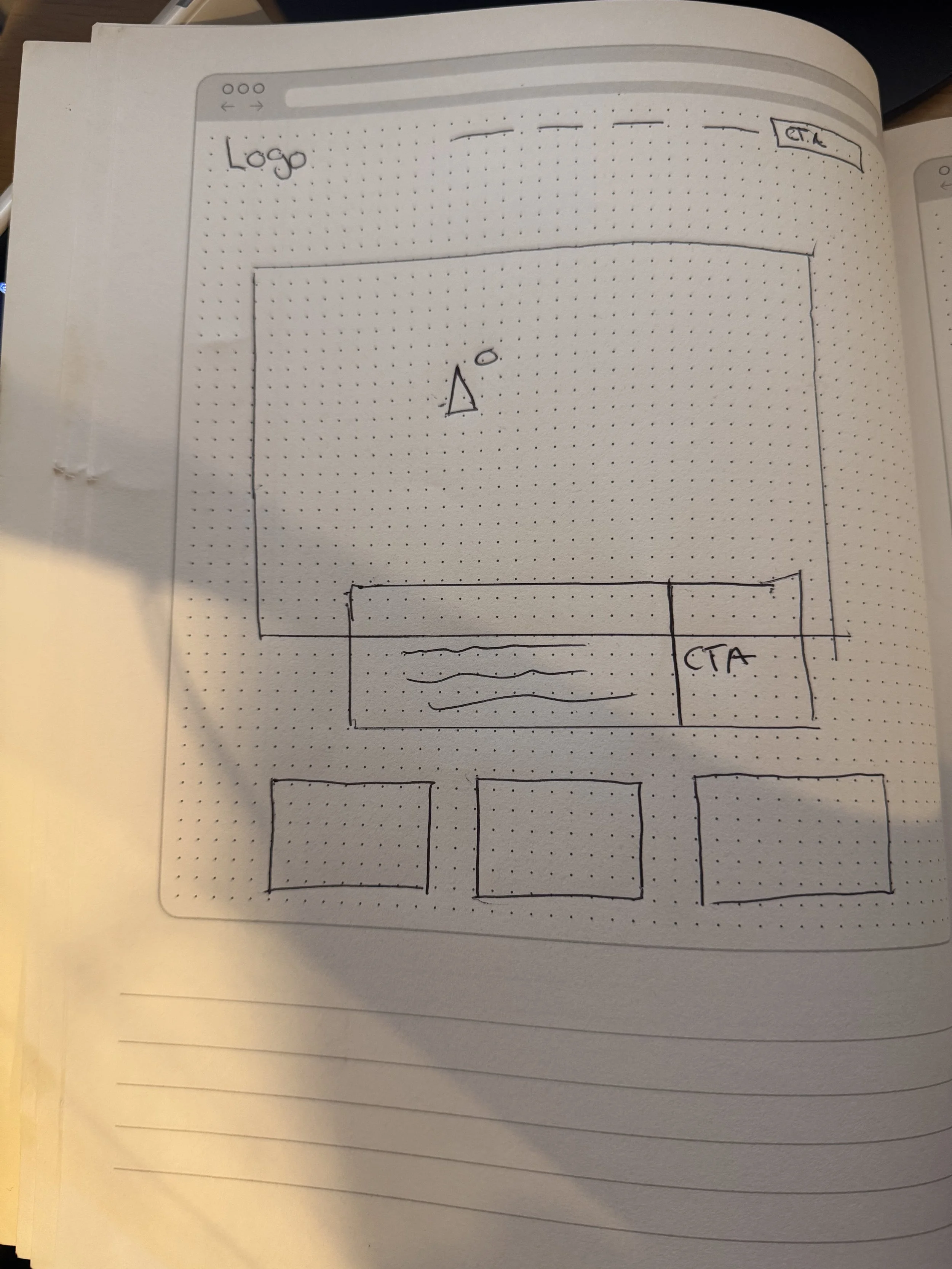
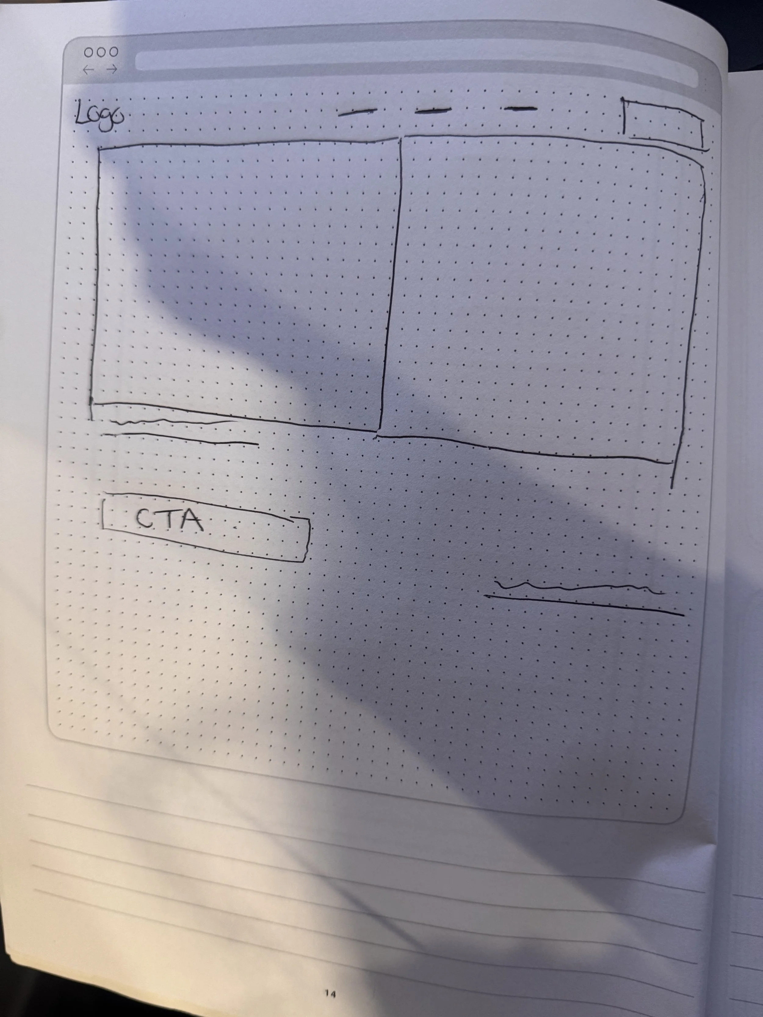
Working on the flow of the landing page
Visual and UI Design ( Grids, Layouts, Components, etc)
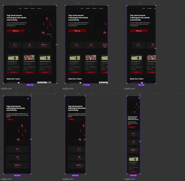
Making the landing page design responsive with different breakpoints
Increase signups and improve the clarity of information for busy parents
Creative awareness about the platform
Building trust with a platform that is meant for parents to trust FAA with the development and well-being of their children
Get users to sign up once they find the website helpful and reliable
This project focuses on designing a responsive landing page for a youth soccer program to make it easier for parents to explore sessions, view coaches, and book memberships
Research & insight
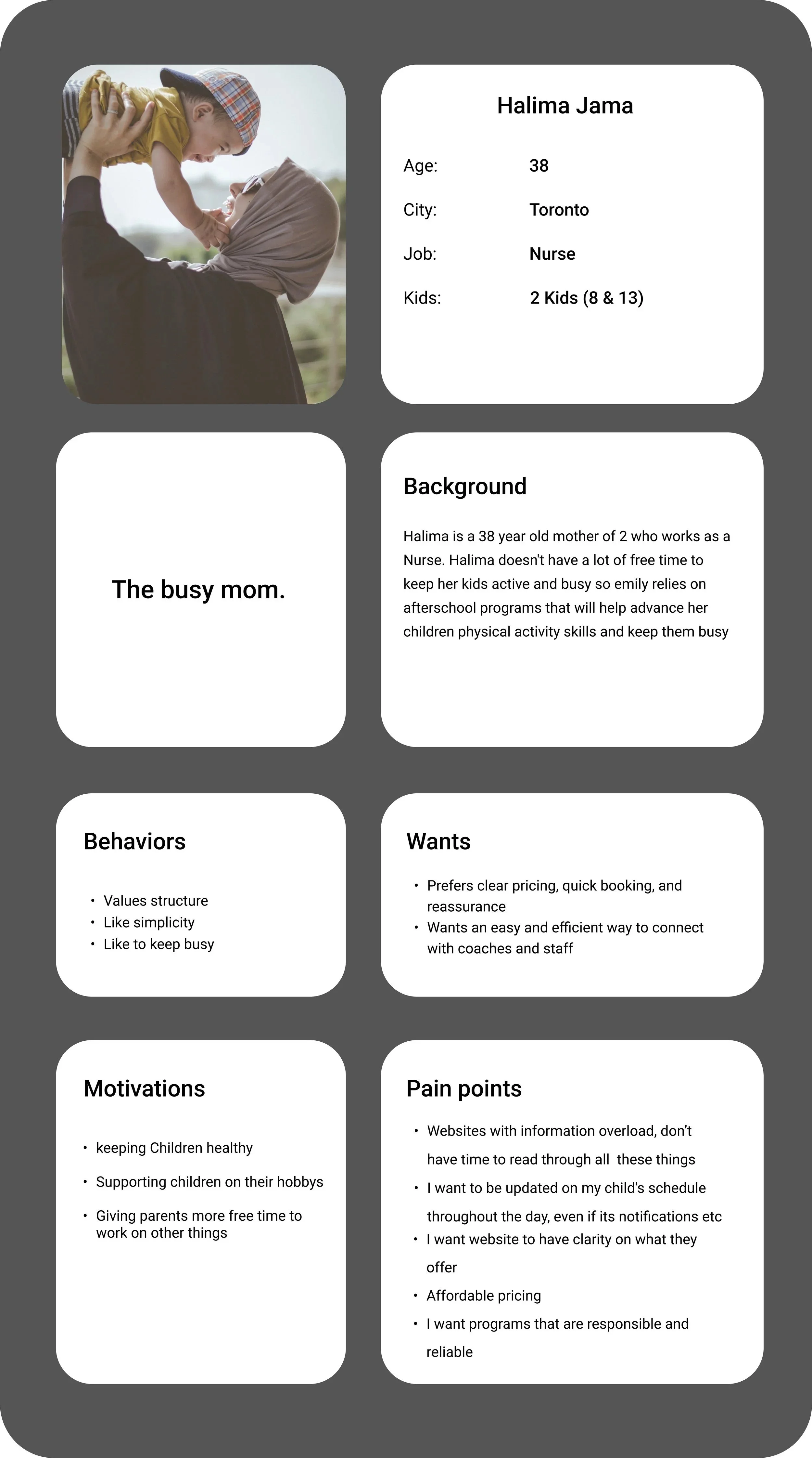
User Personas
Key pain points
Overloaded pages with dense text and too many links
Hidden or missing schedule information
Inconsistent use of color and hierarchy, making navigation difficult
Registration forms that aren’t optimized for mobile
Lack of visual trust cues (parent testimonials, safety info)
Competitive analysis Findings
How do these sites communicate trust, simplify enrollment, and adapt to parents browsing on mobile devices
Visual Hierarchy Often Felt Overwhelming
Schedules and Pricing Were Hard to Find
Inconsistent Branding Reduced Trust
Mobile Usability Was an Afterthought
Photography Felt Staged or Generic
Ideation & Visual Direction
Font Pair
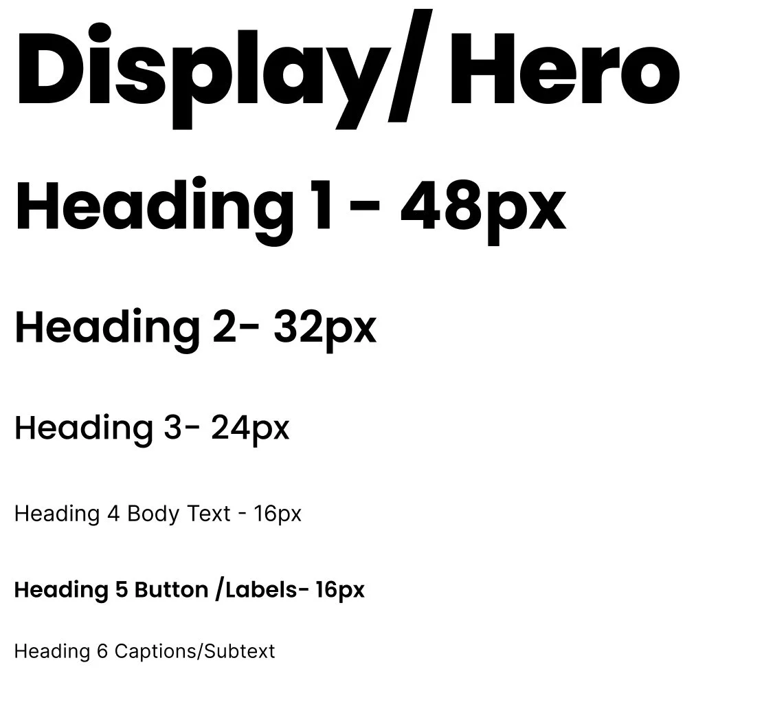
Poppins + Inter
Montserrat + Roboto
Baloo 2 + Open Sans
WCAG 2.2 Level AA compliance
3. Line height
4. Letter spacing
5. Font loading
Typography Exploration
Pros
Friendly, modern, supports variable weights
Professional and structured, widely used
Super friendly for kids program
Poppins + Inter
Cons
Slightly techy when not balanced with warm imagery
Too corporate for kids focused theme
Not ideal for long paragraphs, lacks visual maturity
Accessibility & WCAG
Tone
Energetic, + approachable
Modern + Structured
Playful + Casual
Friendly and modern: Rounded terminals of Poppins soften the brand’s look
Trustworthy and professional: Inter provides a clean, neutral base that balances the playfulness of Poppins
Energetic but accessible: The geometric style communicates precision and activity (soccer’s motion) while the generous line height keeps text airy and readable
Minimum body text 16px (1rem) ensures readability for most users. Headings meet size contrast requirements even with lighter weights.
1.5× for paragraphs ensures legibility for low-vision and cognitive accessibility
Kept above 0.5% for uppercase and small text for clarity.
Both are open-source variable fonts → fast loading, fewer layout shifts
Color System & Visual Language
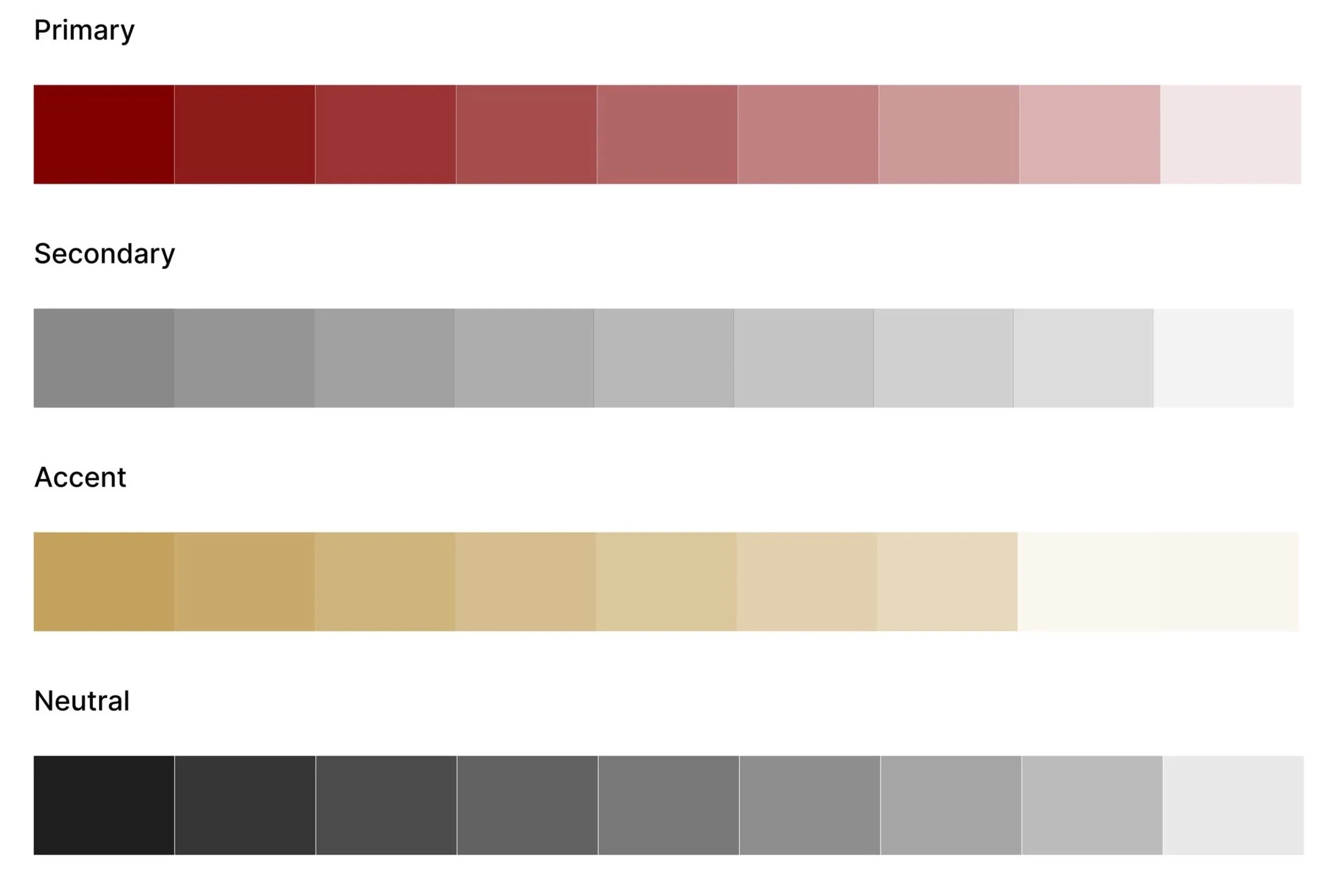
Accessibility was a key consideration in developing this color system. Using Stark, I tested text and background combinations to ensure they met or exceeded WCAG 2.2 standards for contrast and legibility
Responsive Grid System & Layout Structure
Desktop: 12-col + 8 px rows
Tablet: 8-col + 8 px rows
Mobile: 4-col + 8 px rows
12-column grid with 8 px baseline rows ensures horizontal alignment and vertical rhythm across breakpoints
Style Guide & Design System
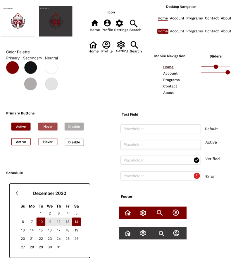
The style guide translates the brand identity into a clear, usable system defining hierarchy, color roles, icon styles, and component states. It balances visual expression with usability, ensuring the interface feels cohesive, accessible, and production-ready across breakpoints.
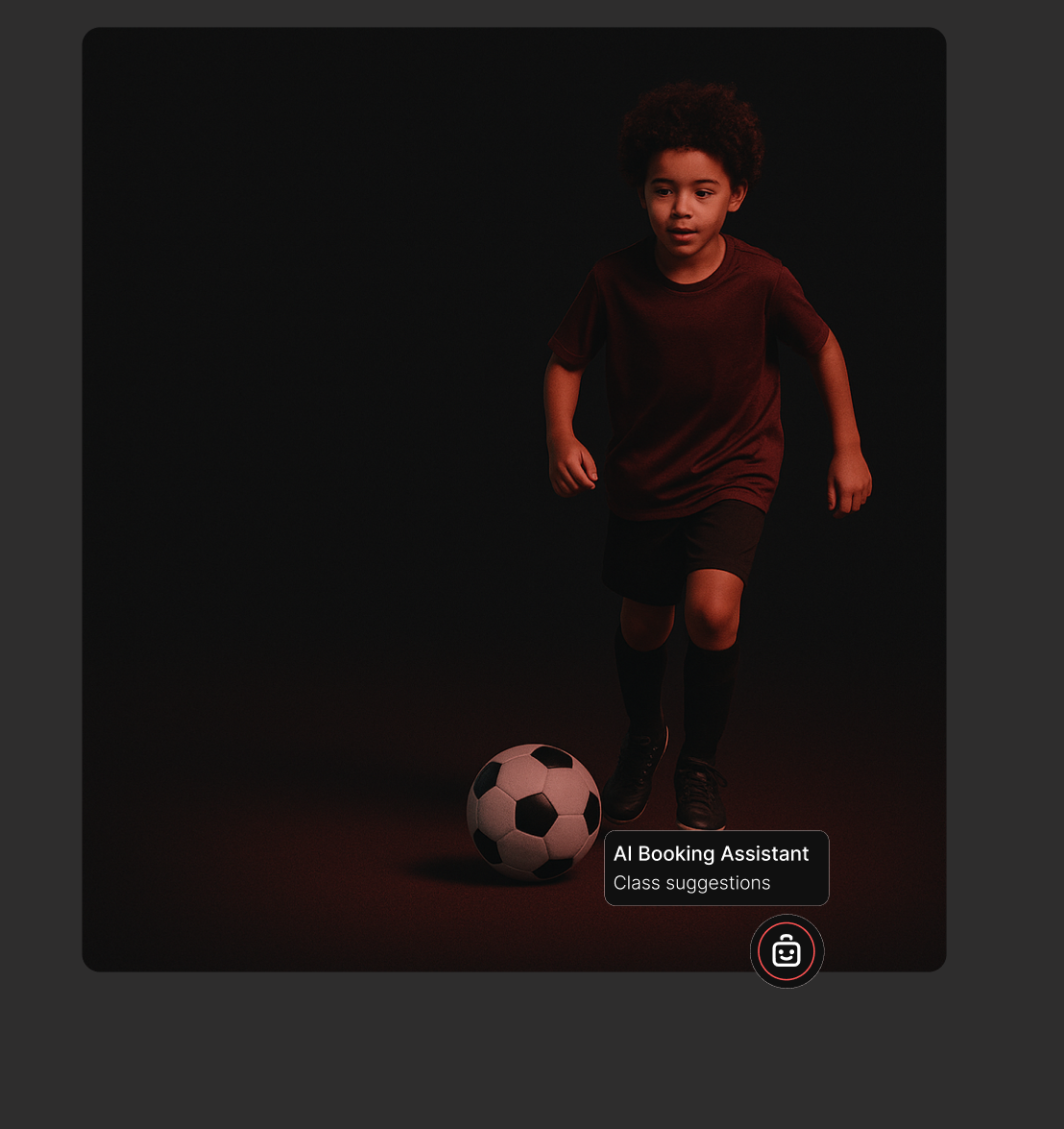
AI progressive disclosure
Visual Design
Light & Dark Mode Design System
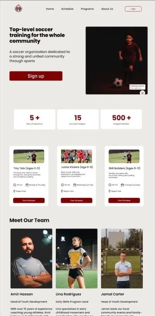
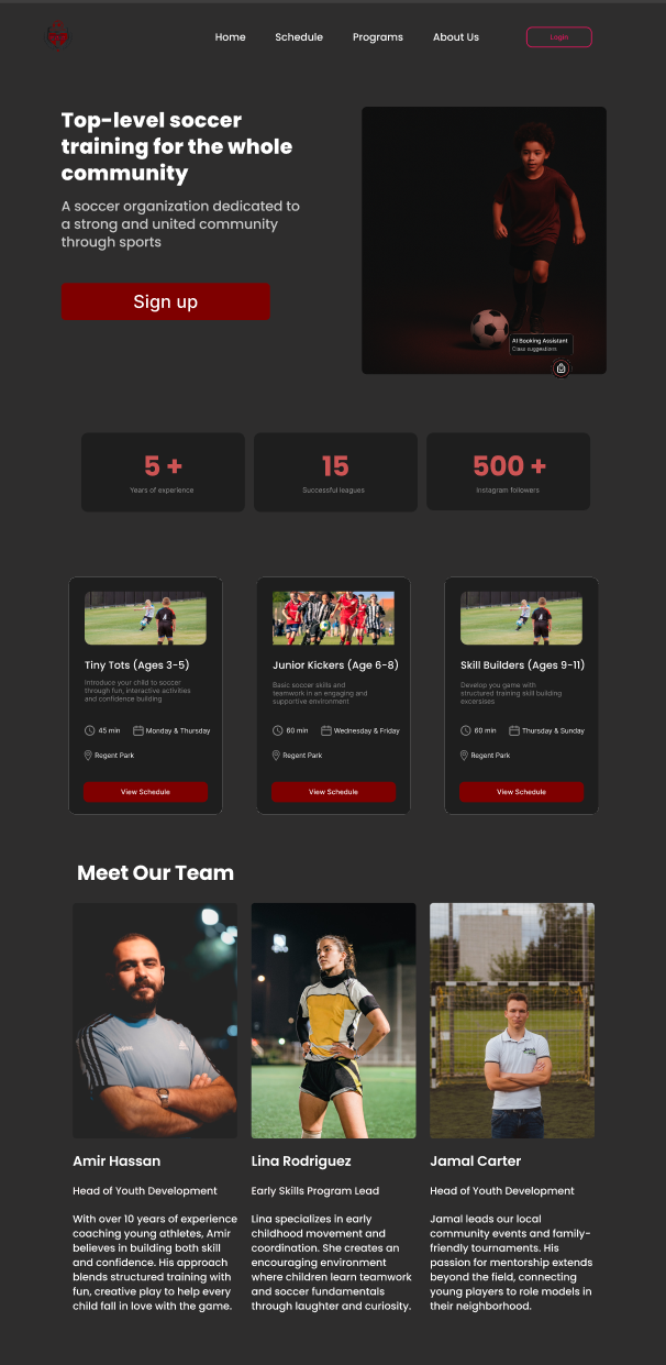
light and dark mode versions of the interface to enhance user comfort and accessibility, allowing users to select a theme that best fits their environment and visual preferences
Design responding to different breakpoints


