Overview
A capstone project for a mobile health app where I designed the visual identity and logo to represent the app’s core values: accessibility, wellness, connectivity, and empowerment. The logo serves as the foundational asset for the app’s branding across UI, iconography, and marketing materials.
Research & Insights
Market research: Overview of existing mobile health app brands, competitor logos, color schemes.
Key brand attributes: trust, clarity, friendliness, modern health tech.
Brand tone & style keywords: human‑first, clean, medical achievability, digital health.
Blue
Trust, dependability, and calmness. It's a go-to color for healthcare brands to help establish a sense of security and professionalism.
Orange
Optimism, creativity, warmth, and enthusiasm. It can be used to make an app feel more friendly and inviting. It can also represent sociability and high energy
Logo Concept & Ideation
I began the ideation process by sketching out multiple logo concepts. This early analog phase allowed for unrestricted creativity and fast exploration of form and structure.
A heart outline enveloping the text “HealthHub.” This version emphasized emotional connection and care, aligning well with the compassionate mission of the app. It became the foundation for the final design
The final logo captures:
A sense of care and approachability
A strong connection to health
Scalability for use across app icons, splash screens, and marketing material

Market research


Illustration Set
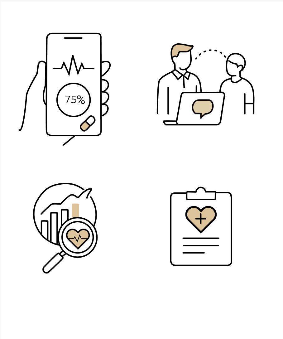
To enhance the visual narrative and build out the brand system for HealthHub, I created a set of minimal, clean-line illustrations tailored for healthcare and mobile-first interfaces.
The goal was to craft visuals that felt light, modern, trustworthy, and easy to understand aligning with the calm and supportive tone required for healthcare digital products.
Before jumping into detail, I established the basic shapes and proportions using framed boxes and a consistent grid.
I focused on:
silhouette clarity
visual balance
recognizability
Using the Pen Tool and Shape tools in Figma, I created:
consistent stroke thickness (2 px)
rounded caps + joints
simplified geometry
clean, single-path outlines where possible
This ensured a flexible and scalable system.
Adding Visual Hierarchy
Tiny details like:
thicker outline for primary objects
smaller strokes for secondary details
larger spacing between elements
intentional negative space
helped make the illustrations feel airy and modern.
I grouped elements, flattened paths, and prepared:
SVG files for scalability
PNG exports for case study display
version variations (filled vs line)
components so future assets follow the same style


Motion Extension
To enhance clarity and engagement, I extended the static line art illustrations into subtle motion animations.
The goal was to bring the visuals to life while preserving the simplicity and restraint of the original system.
Each animation uses minimal, purposeful micro-interactions such as gentle pulses, soft scanning movements, and conversational cues to reinforce meaning without distracting from the content. Motion was treated as a supporting layer, not decoration, ensuring the illustrations remain calm, accessible, and scalable across product touchpoint.
