Building the motion identity for Nabeya Designs
Overview
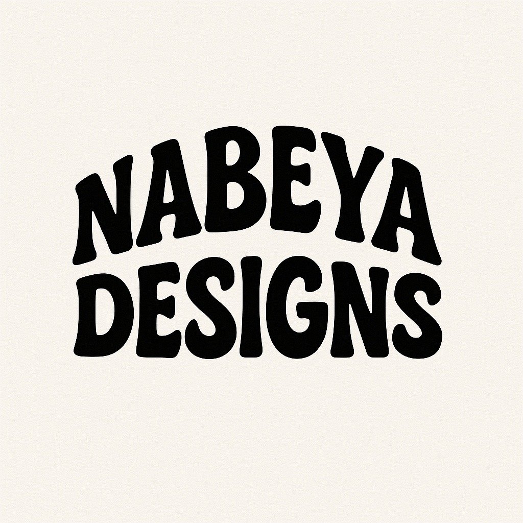
Nabeya Designs needed a visual identity that reflected creativity, motion, and modern aesthetic expression. I created a playful typographic logo that evolves from hand-drawn sketches into a polished brand mark, then brought it to life through animation and motion design. This exploration allowed me to blend my strengths in visual design, typography, illustration, and motion graphics into one cohesive brand story
Inspiration & Exploration
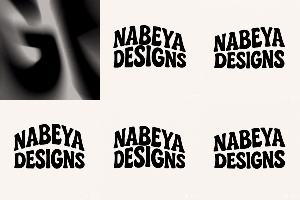
As a designer, one of the most powerful parts of my creative process is gathering inspiration before creating anything.I’ve always been taught especially through my UX/UI work that great design doesn’t start with a blank canvas. It starts with observing what already exists, understanding patterns, and letting other designers’ ideas spark your own direction
Concept Sketching
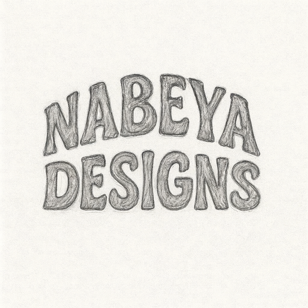
I started with loose pencil sketches to explore shape, rhythm, and the overall personality of the letters. The goal was to keep the typography approachable, fun, and slightly imperfect the kind of shapes that feel alive even before animation
Digital Refinement
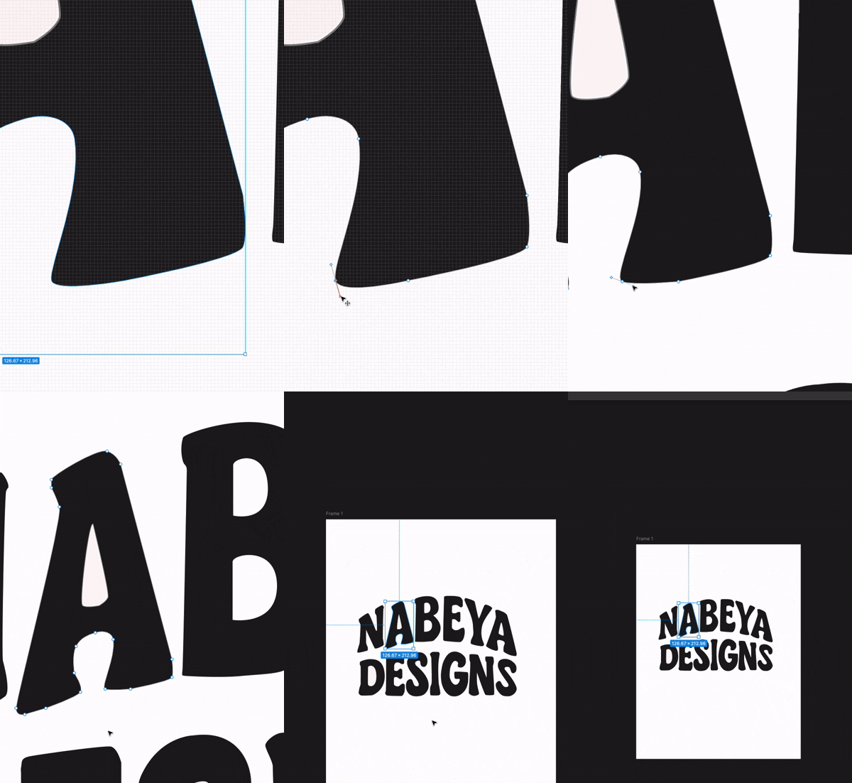
After sketching, I brought the design into digital form on Figma. I refined the curves, unified the weight, cleaned the letterforms, and created a balanced composition. The arching structure adds personality while still keeping the mark clean and minimal.
Motion Exploration
As I moved from static design into motion, I wanted the animation to enhance the brand’s personality without overwhelming the viewer. I also wanted to work under the lease of motion accessibility especially how certain animations can trigger discomfort, distraction, or motion sensitivity for some users.
This process helped me balance creativity and responsibility, ensuring that the motion feels delightful, inclusive, and aligned with the design’s overall tone
Motion tools
After Effects (Adobe)
Veo
KingAI
Capcut


