Before
After
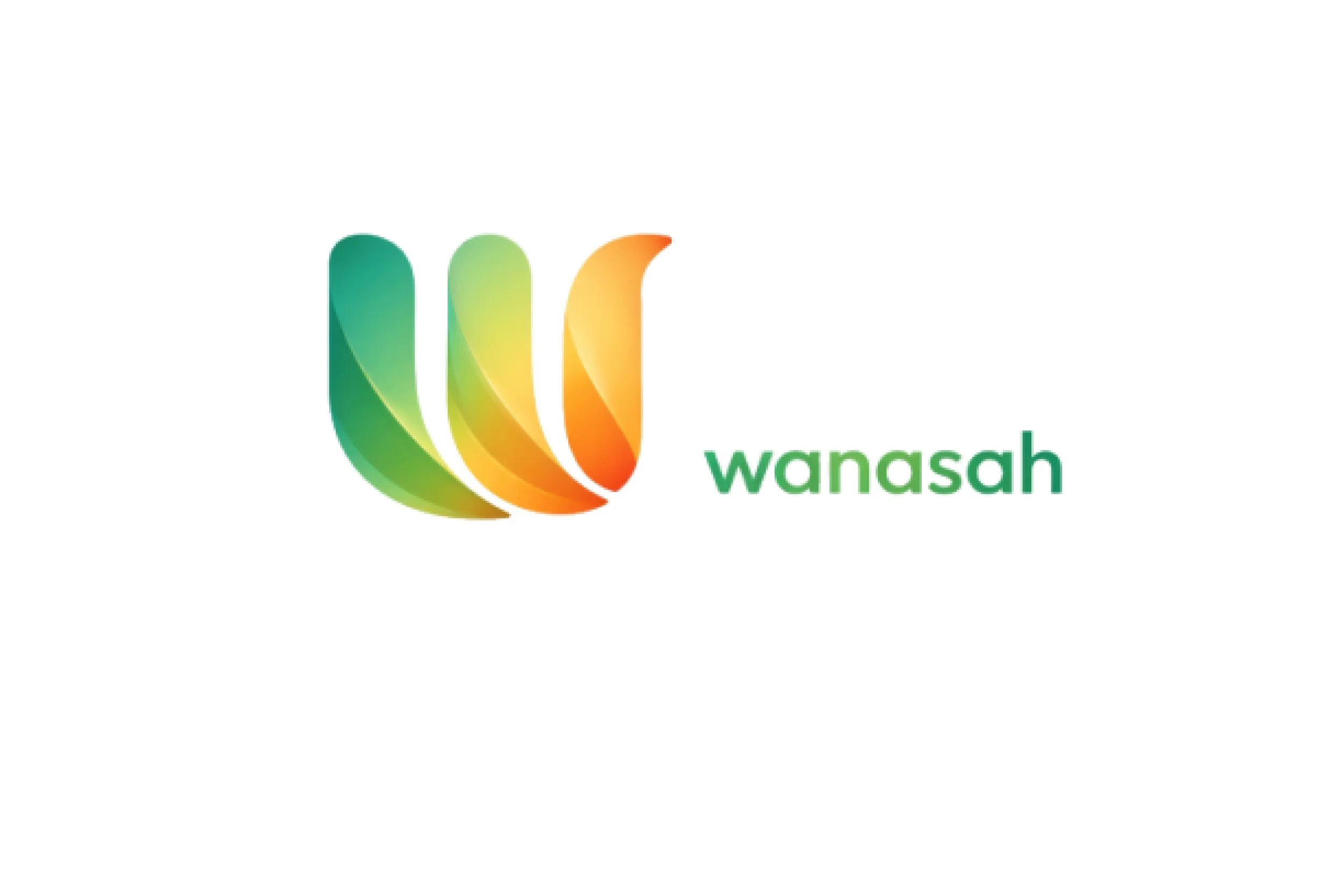
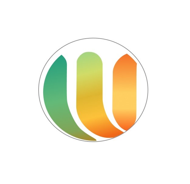
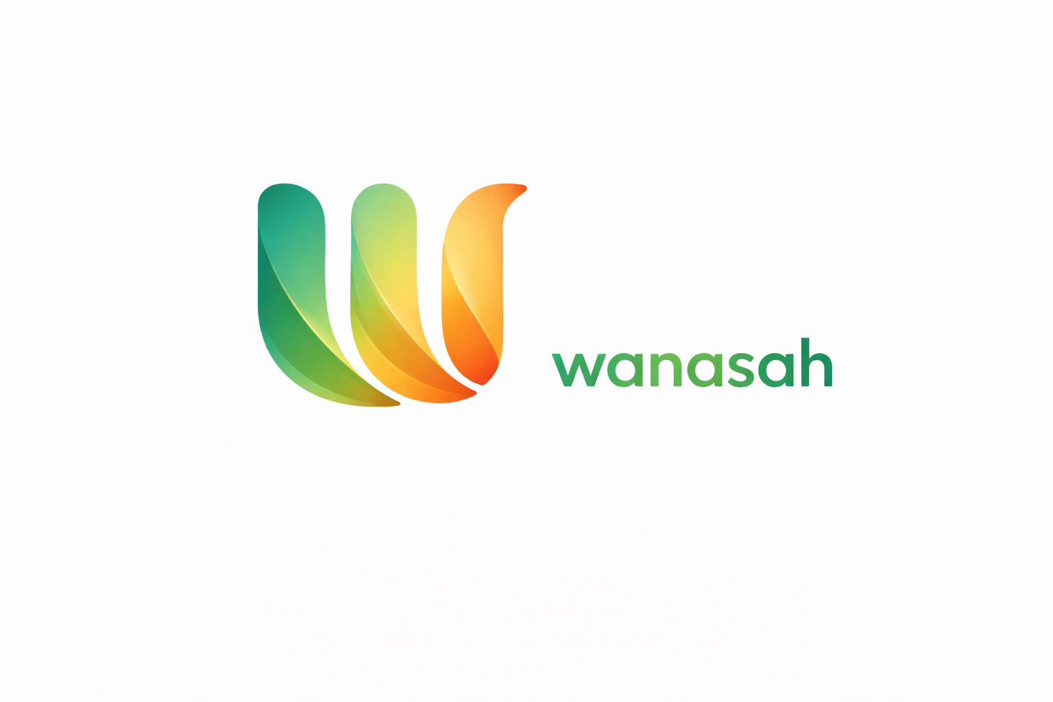
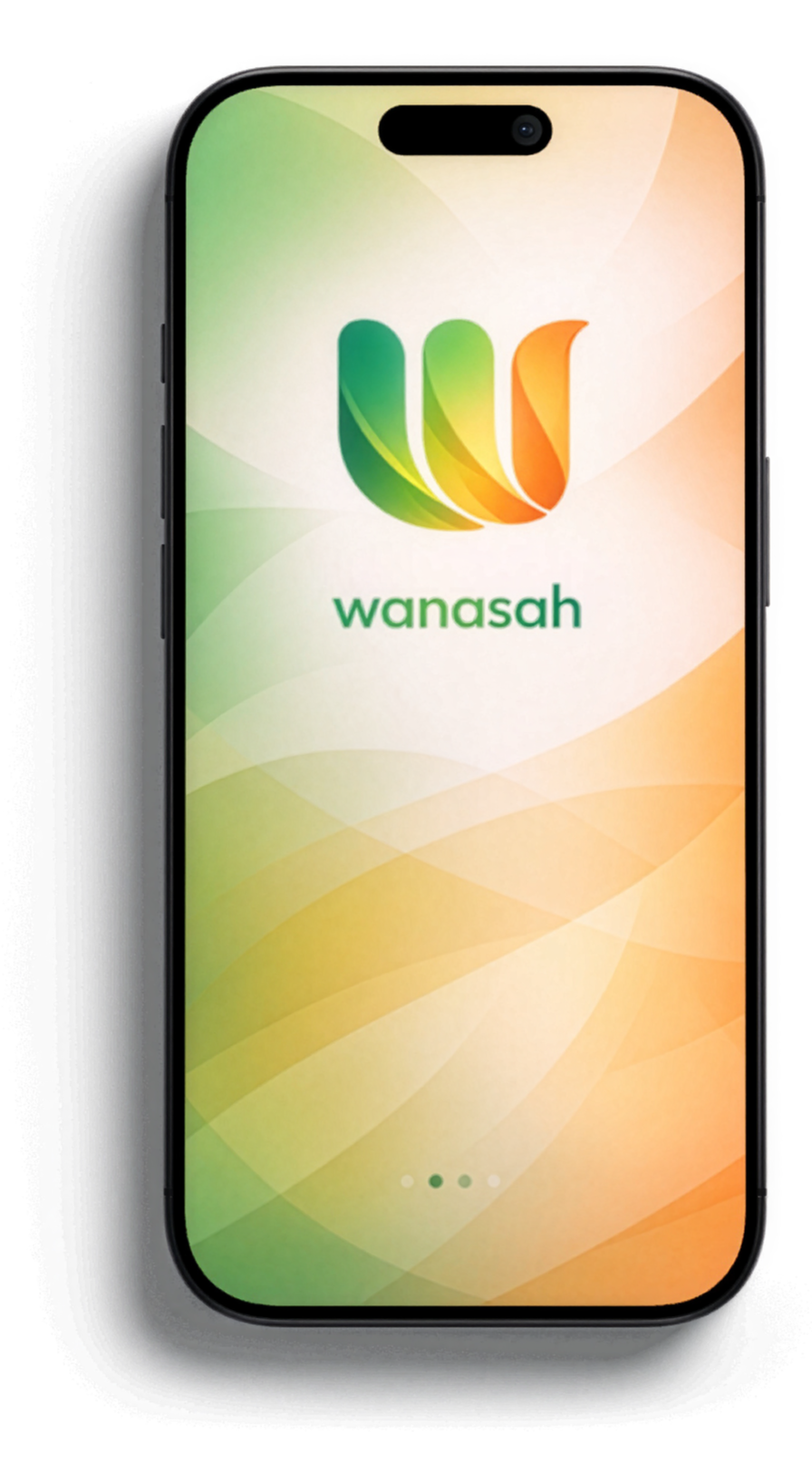
Fluid Unity
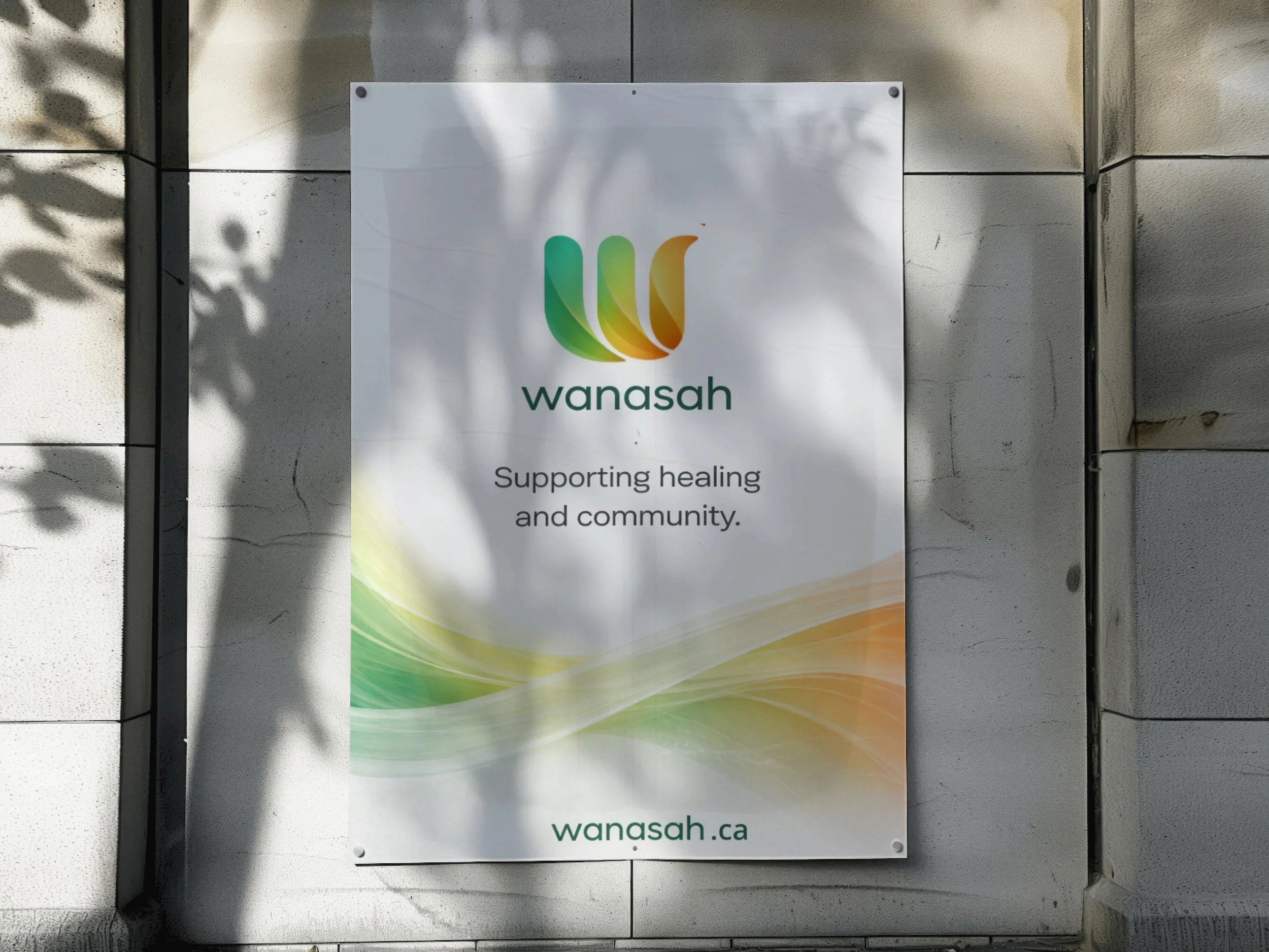
The layered, curved forms represent collective care and interconnected journeys. Each shape flows into the next, symbolizing how healing happens through community, family, and shared support rather than in isolation.
Warm Growth
The green-to-gold gradient reflects growth, renewal, and hope. These natural transitions communicate warmth and optimism, reinforcing Wanasah as a safe, welcoming space for Black youth and their families.
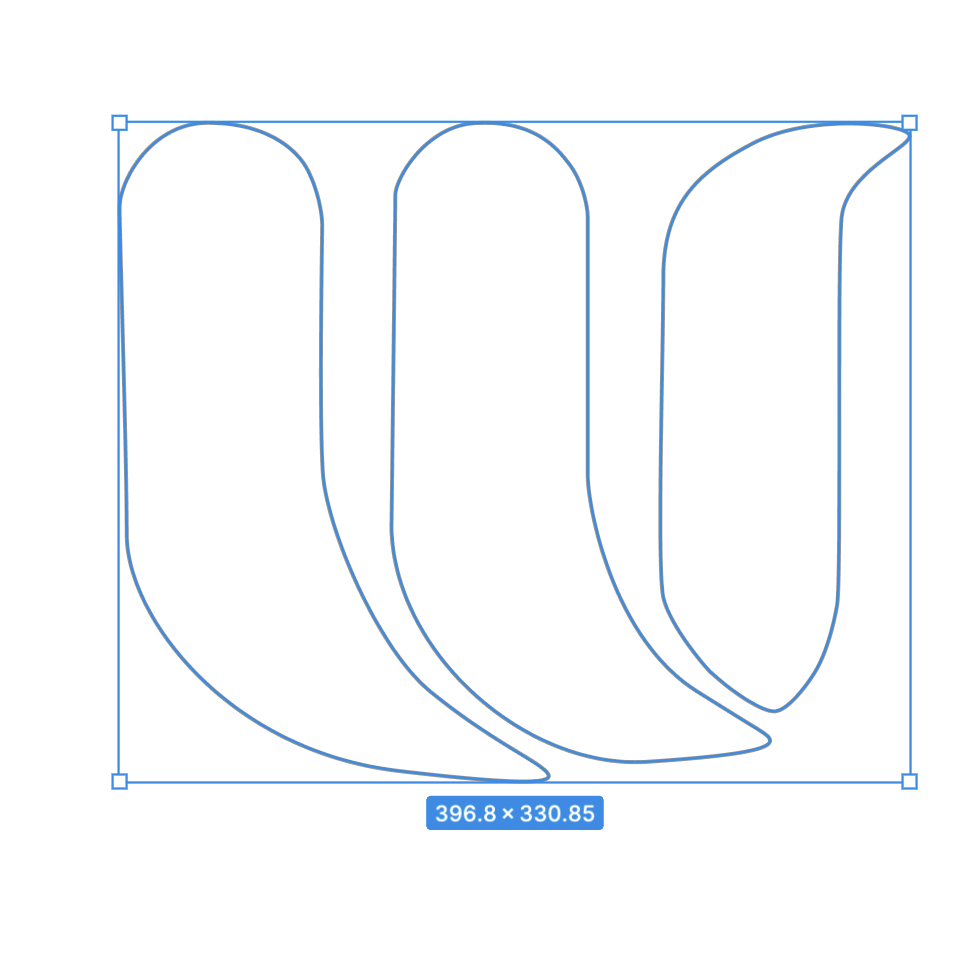
A Living System
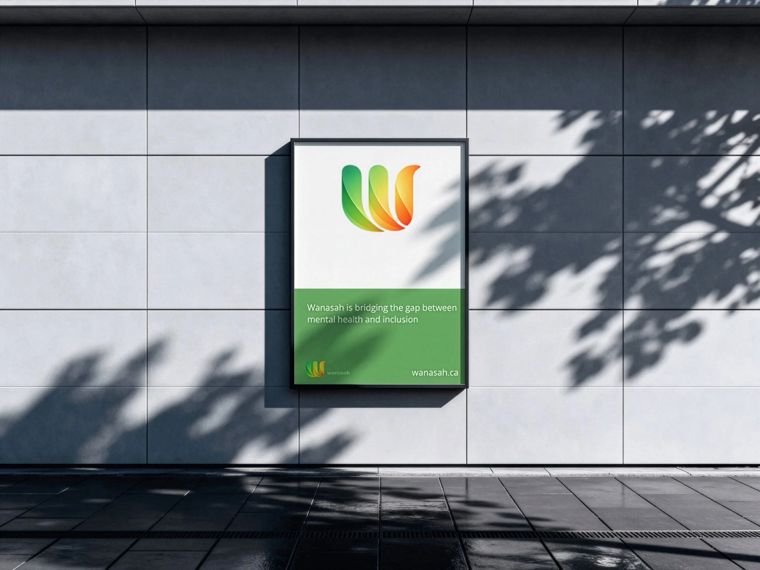
The repeated “W” form creates consistency while remaining flexible. Designed as a system rather than a static mark, the logo adapts across digital, print, and community spaces while maintaining recognition and trust.